
Typography and Type Design
The focus of this course is on the introduction to typography, design, classification, and the use of type as a design element. Students will be encouraged to use of the computer for revision of final designs using various illustrations/type design software.
- Download the Syllabus
- Project 1
The purpose of this assignment is to develop a more acute understanding of and appreciation for the intricacies that make up a typeface. For this assignment, the student will create an upper- and lowercase 27th letter of the western alphabet (i.e. our alphabet). The student will create a name for the letter, a place in the existing alphabet. The student will focus on the stress, stroke, and serif of each individual letter, all of which contribute to the overall look, personality, and readability of the typeface.
Download Assignment SheetDownload Exercise Sheet - Project 2
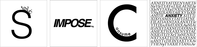
For this project, the student will explore its expressive of a word by manipulating the letterforms. To achieve the desired effect, avoid simply repeating the words or creating an illustration from the letterforms. The best solutions not only enhance the word’s meaning but are clever and aesthetically pleasing. Sometimes an unexpected effect can be achieved when the typographic solution contradicts the meaning of the word, setting “big” with small type, for example. While the typestyle the student chooses is important to the message, the manipulation of the letterforms should be what conveys the meaning.
Download Assignment SheetDownload Exercise Sheet - Project 3
This project builds on the ideas started in the last project, but adds the additional components—motion and time. Motion and time can add many complications to this project. Now the student must consider what is on screen and what is not on screen at any point in time. How will the solution unfold over time? How will motion come into play when animating their solution.
Download Assignment SheetDownload Exercise Sheet - Project 4
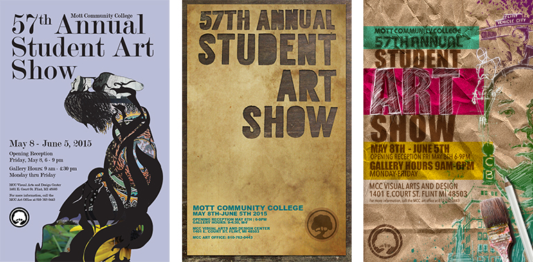
Every year, Mott Community College hosts an art show with selected student work. The students in the class have the opportunity to design the poster for the annual student show held in May. The purpose of this project is to: promote the student show, to provide information about the show, to inspire viewer’s to attend the opening of the show, and to promote the art program at Mott Community College.
Download Assignment SheetDownload Exercise Sheet - Project 5
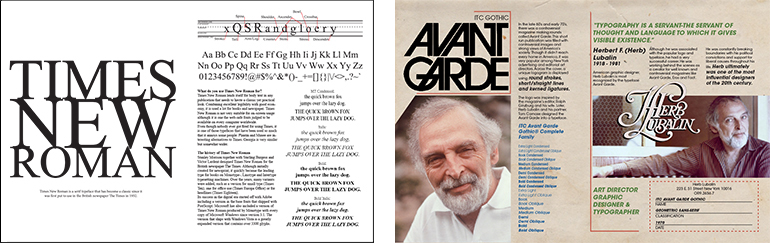
The purpose of this assignment is to further explore typographic hierarchy as well as to begin to understand grids. A grid is the skeleton or framework that allows for arranging content within the space of the page. It is the building block of all digital images and marks and is not a rigid formula, but instead a flexible, resilient structure. While singlecolumn grids work well for simple documents, multicolumn grids provide flexible formats for publications that have a complex hierarchy or that integrate text and illustrations. The more columns you create, the more flexible your grid becomes. For the assignment, the student will create a spread (two pages that face each other, books and magazines are designed using spreads) that incorporate a type designer and one of their fonts.
Download Assignment SheetDownload Exercise Sheet - Project 6
The purpose of this assignment is to explore typography in the environment and in three dimensional applications. Typography doesn’t just have to be for purposes of communication. It can also be a creative endeavor. There are also more pratical applications for typography in the environment such as for signage and environmental graphics. Typography is not just limited to words on the page. For the assignment, the student will create a three dimensional or environmental typographic project. The project must take some physical form. The student cannot just take pictures of existing typography in the environment or take pictures of things that look like letters. The project needs to be created by the student. The student may use anything in the lab. The student can use the 3D room and woodshop. The could also contact the FabLab.
Download Assignment SheetDownload Exercise Sheet - Project 7
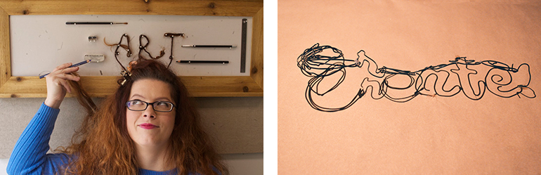
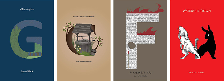
The purpose of this assignment is to explore typography and lettering as well as the differences between the two. Typography is the study of setting type. Hand lettering has become a very big trend in typography in recent years. It involves drawing the letterform by hand and then sometimes translating it digitally. Unlike typography, hand lettering may not involve a complete alphabet. It may only involve a single letter. Hand lettering can be seen as custom artwork and can be a little experimental. For the assignment, the student will create a drop cap letterform for his/her favorite book. This project is inspired by the series of drop cap book covers that Jessica Hische illustrated for Penguin. The student will choose a book he/she loves, then create a cover featuring a flourished letterform in the mood and spirit of the chosen book.
Download Assignment SheetDownload Exercise Sheet